Pages

Total Pageviews

Friday 18 January 2013

Analyzing A Malaysian Atlas


Atlas Moden Malaysia Dan Dunia (New Edition)


Introduction

On the process of pushing the implementation of Online Atlas of Malaysia, we need to examine some paper atlases exist in Malaysia. Unlike Australia, Malaysian geography students are not required to buy an atlas as a supplementary. From the image above, this atlas is produced by Oxford Fajar (a branch of Oxford University Press). This atlas was first created in 1992, subsequently second edition in 1996 and in 2007, a new cover was added to the atlas (to mark the 50 years of Oxford Fajar in Malaysia). Having said that, the mapping works was done by Cartographic Department of Oxford University, UK. Secondly, with the new cover of atlas, it doesn't mean any updates to atlas content. The fact is students who purchase the atlas would be seeing statistics of late 80s and early 90s.

Content Analysis

The beauty of the atlas for students and map lovers is the atlas is paper spatial portal of Malaysia. As far as I am concern, there hardly any Atlas of Malaysia for general public purpose. This atlas (image above) is no longer being produced and replaced by Atlas Geografi (Tingkatan 1 to 5)- for secondary students. The new atlas should not be even called an atlas because it has so much text as opposed to text. The main reason I could guess for the atlas replacement is to reflect the new Geography syllabus in Malaysia since 2003. The Atlas Moden Malaysia & Dunia reflects the curriculum of 90s and early 2003.

 The way atlas structure is like this:
1) Concept of maps
2) Graphics of environment
3) Maps of Malaysia and its associated thematic content
4) South East Asia studies
5) Asia studies
6) Continent-to-Continent Studies
7) Global Issues and Time Zones

Put in simple, the atlas is meant for the old Geography syllabus which was more interesting than 2003 version of Geography syllabus. However, in the context of the article, I will be focusing on Malaysiana section. As far for the content, it is much of reflection of situation in 90s Malaysia. Surprisingly, these maps were never updated since mid 90s I presume to cater rapid-changing situation on ground

The topics covered:
1) Physical Environment
2) Climate
3) Agriculture , Fishing & Vegetation
4) Geology & Mining
5) Transportation network
6) State by State economic development maps
7) Topographic maps of Malaysia

For me, there are no issues in regards with layout of the content and the geographical message crossed over. As matter of fact, we could draw lessons from the atlas in topics to be covered for national atlas. At conclusion of my final year project presentation, I have stated that a national atlas is the geographical/spatial window to a nation. The topics above fit the purpose of a national atlas. Only thing will differ a national atlas and a student atlas in content terms is a national atlas would have larger depth on geographic content of the nation.

Cartographic Design

Having said the greatness in the content, I have reservation in terms of cartographic preparation. Cartography is the science and art of making maps and it is truly the gateway of science to arts and vice versa. An Atlas prior to the era of Internet mapping could be consider as a pinnacle of cartographic products. Firstly before the Internet, an atlas is a pair of binoculars for the readers to understand the world. In 1950s, Times Reference Atlas Mid-Century Edition came in 5 to 6 volumes and specifically shown maps that are less-Euro centric. Hidden areas of former Soviet Union came to light in the post-War period (reflecting the completion of the Soviet grand mapping of Soviet Union).
In short, if an atlas wants to serve the purpose of window to the world, expectation of cartographic design is much higher.

Below here are examples of problematic Cartographic Design in this Atlas

Example 1

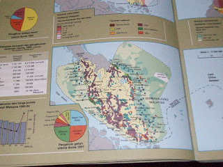
Economic Map of Pahang
 
 
In maps, there must be clear hierarchical ranking in the geographical data displayed. Maps in atlases are controlled painting, not simply playing with figure-ground relationship or ignoring the ranking. The above map ( press for larger) focuses on the economic situation in Pahang, the largest state in Peninsular Malaysia. Line symbols for state borders are neatly done. However, when it comes to the district borders of the state, there seems to be a confusion whether Pahang is splintered into many states. To make the situation worse, the name of districts in Pahang has the same font size to other State names.
In terms of colour, the colour distinction around the Kuantan side is not sufficiently distinctive. Light purplish-brown area shows the urban areas while dark purple lines transversing the region are the gas pipelines. For pipeline, a different symbol like a line with circles dotting along it would be a preffered option.
In this case, the map has issues with hierarchy and symbology scheme

Example 2

Agricultural and Fishing Map of Malaysia
 
The map above illustrates geographical data overload. It is fine to show in a single map to show agricultural product and fishing distribution. After all, they are all considered as a primary industry.  Firstly, there is too many town names displayed in the map especially on the coast. Secondly, the colour scheme for the rubber estates (in purple) is too strong (as in dark) which makes reading of text bit difficult. Another example would be the blue dots which shows one of the way fishermen capture fish in the deep sea. Since it is dark blue, it hides the colour of the text of city names. It makes reading not pleasant.

In this case, data overload combined with poor colour scheme demonstrate the map is poorly designed.

Conclusion

In short, the atlas serves it purpose but the map design needs a lot of work to be done. Positives of the atlas would be:
1) Content matches with geography syllabus
2) Reflects the situation in 1990s very well
3) Good accompanying topographical maps (which I did not discuss much in the atlas)

Downsides with the atlas would be:
1) Outdated maps and geographical data, being used unofficially by students till 2007+. Having a new cover in 2007 did not translate in changes in the content
2) Poor cartographic design in the thematic maps (on Malaysian section)

We came to an end of the article, we can learn that good content with good design are the foundations of good atlas making. It is rather unfortunate of atlases like above are no longer in circulation in Malaysia. One of the street directories companies in Malaysia did produce Atlas Geografi but it does not match the standard of Atlas Moden Malaysia & Dunia. My desire is that Malaysia should aspire to have good national atlases online or in hardcopy or both.


1 comment: